The Personalized Recap Share
Turn a year of usage data into a card people post themselves.
Every product with logged-in users is sitting on a year of data it never shows anyone. Sessions, minutes, a streak, a rank against other users, all of it just accumulating in a database column, unused. Duolingo and Spotify both take that same exhaust and hand each user one designed card built entirely out of their own numbers, then ask them to post it. Nobody has to write copy about how great the product is. The user does that part, because the card is about them, not you.
What to do: Pull each user's own usage data (time on product, streak, rank, a personal-best number), design one card around it that ships on a fixed recurring date, and put a native share button on the card itself. Pay a small, direct reward for the act of sharing, separate from whatever they already earned by using the product all year.
Why it works: A stats card about a user's own year gets shared because it makes them look good or interesting, not because your brand asked nicely.
Example: Duolingo's Year in Review packages a user's total XP, minutes, streak length, and global rank into a shareable card and offers a bonus for sharing it. Spotify Wrapped runs the same mechanic every December with interactive share cards built to post straight to social. Both ran again in December 2025. Spotify says that run was shared more than 500 million times, 41 percent more than the year before, with over 200 million engaged users in the first 24 hours alone, a bar that took 62 hours to clear the previous December.
Walk it through
Neither company built this in one release. Both took years to get it right, and the sequence they followed is the actual playbook.
1. Bank the raw data all year and say nothing about it.
Duolingo logs XP, minutes, streak length, and lessons completed every day a user opens the app. Spotify logs every stream. Neither product mentions "your data" while the year is happening. The numbers just accumulate, waiting for a date on the calendar.
2. Ship the card on a fixed date, not a random one.
Duolingo ships Year in Review in December. Spotify ships Wrapped the first week of December, every year, like clockwork. A fixed date does two things at once. It gives users a reason to anticipate it, which is free marketing, and it means everyone's card lands in the same week, so the whole audience becomes the topic on social feeds at once instead of trickling out one post at a time.
3. Reward the click to share, not just the year of usage.
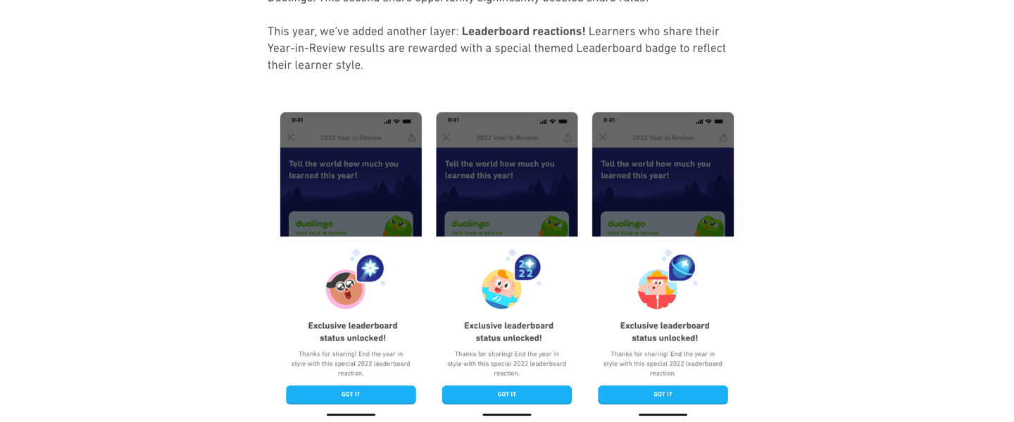
That is a real screenshot from Duolingo's own engineering writeup of how the feature evolved. Their team has been candid about a problem they hit early on. Once they added a comparison stat (XP percentile) to the card, the top 10 percent of XP earners generated more than half of all shares. Everyone else got a card with nothing flattering to post, so most users never opened the share sheet. Their fix was "learner styles," personas assigned by behavior so a low-XP learner still gets a card that says something specific and positive about them, not just a raw number that loses. They credit that change with lifting share rates broadly. The badge in the screenshot above, unlocked only after you share, is the layer they added on top of that.
4. Build for where people actually post, not one generic share link.
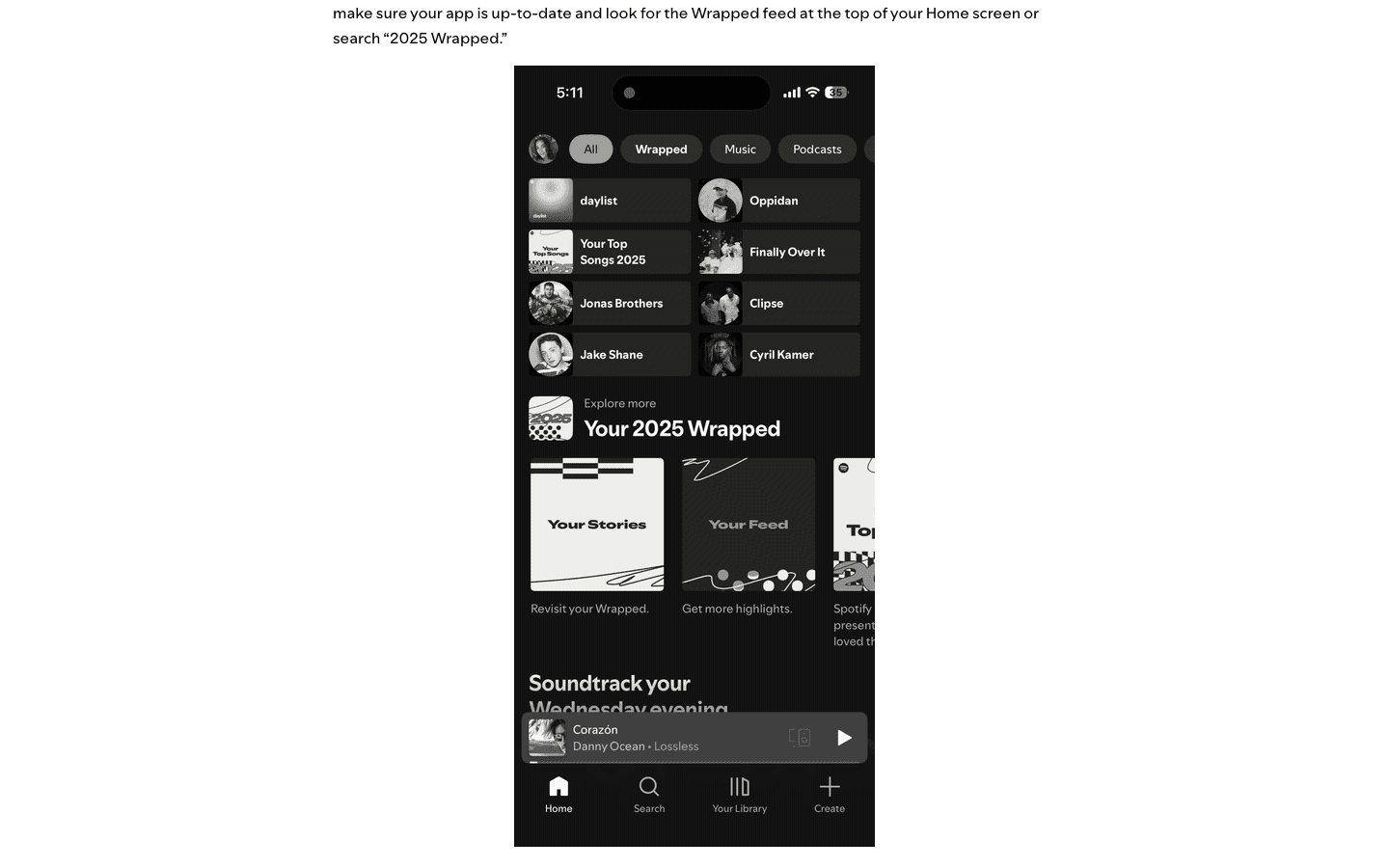
Spotify's 2025 redesign shipped native share cards for individual data points, plus a dedicated feed of story-formatted slides you can revisit and post one at a time, shown above. It also added direct posting to TikTok alongside Instagram and Snapchat. Whatever combination of changes did it, the volume moved: 500 million-plus shares, up 41 percent, in the same December Duolingo was running its own version of the same play.
The read
- The date is doing marketing for you. A fixed annual release means people anticipate it, and it means the whole audience's card lands in the same week, so the volume looks like a cultural moment instead of a trickle of posts.
- The reward is separate from the data. The card is about the user's year. The badge or bonus is about the click to share. Keep that split deliberate, the incentive is for the action, not the underlying usage.
- Universality beats leaderboard-only. Duolingo learned this directly. A card that only flatters top performers gets shared by top performers only. Give everyone, not just the top 10 percent, a version that says something specific and positive about their own year.
Steal it
Find the one number your product already tracks that makes someone look good or interesting once you isolate it. Tasks shipped, money saved, words written, distance run, whatever it is, your usage logs already have it. Wrap it in one polished, on-brand template, ship it on a date users can start expecting year after year, and pay the share itself with a small reward rather than assuming a nice-looking card is incentive enough.
Defend it on two fronts. First, the format is public now, anyone can read this chapter and copy the mechanic, so your real moat is the specific combination of data only your product generates, not the idea of a recap card. Second, never auto-post on a user's behalf and never surface a number they would not want made public. A recap that trades a short-term spike in shares for a user's trust in what your product does with their data is a bad trade.
Gotchas
- You need real, accumulated history. This does not work as a one-off. A user with three days of activity has no year to wrap. Wait for genuine tenure or skip it.
- The card alone will not move volume. Duolingo's own writeup describes cards that sat mostly unshared until a reward was attached to the click. Budget for the incentive, not just the design.
- Only surface what flatters. Streaks, ranks, and totals work because people want them seen. Idle time, drop-off points, or anything a user would rather you kept quiet does not belong on the card. Cross that line and the "recap" reads as a warning about what you track, not something worth posting.