Design The Ask At The Cap
The 2026 penny gap fires mid-session on a usage meter, not on one free-to-paid signup screen.
The old penny gap lived on one screen: the moment a free trial ran out or a free plan nagged you to upgrade. That screen still exists, but it stopped being where the real money moves. In a usage-based product the decision happens mid-session, when the meter hits zero, the agent goes quiet, the build fails, the run cuts off in the middle of something you were counting on finishing. Nobody is shopping in that moment. They are blocked, mid-work, and they either pay to keep going or they close the tab and remember exactly why. Most products still treat that moment as a rate-limit error instead of the best sales moment they will ever get from that user.
What to do: Instrument the exact cap event, not just the plan tier, and design the in-product message and the follow-up email as one system built from the same three facts. Say what happened, what it cost in real usage units the person understands, and give one exact action that unblocks them, not a menu. Send the email within minutes of the cap firing, while the friction is still fresh, never on a weekly digest.
Why it works: Frustration peaks the second someone hits a wall mid-task and decays fast once they close the tab and move on.
Example: Anthropic said in March 2026 that people were "hitting usage limits in Claude Code way faster than expected." Cursor built its whole cap moment around that exact scenario: hit your included usage and Cursor surfaces the ask right inside the editor, offering a choice between turning on pay-as-you-go billing or upgrading to a bigger plan.
Walk it through
I checked Cursor's own docs and Anthropic's public statements in July 2026. Here is the mechanism, piece by piece.
1. The cap fires where the work is happening, not on a billing page.
Cursor's documentation is specific about this. Hitting your included usage surfaces a notice inside the editor itself, the same window you were just working in. Not an email that arrives an hour later. Not a redirect to a separate account dashboard. The ask shows up exactly where the blockage happened.
2. The choice is deliberately narrow.
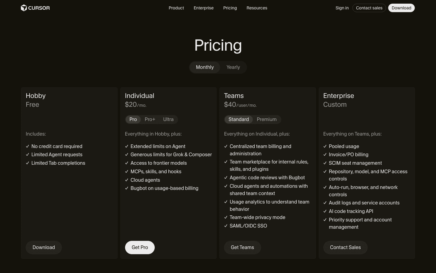
Two paths, per Cursor's own help pages: turn on pay-as-you-go and keep going at the same API rates Cursor itself pays, or upgrade to a plan with a bigger included pool. Usage-based billing isn't a footnote buried in fine print either. It is a named line on the public pricing page.
3. There's a third door that isn't a sale at all.
Cursor also routes people who hit a wall toward Auto, a model picked for cost and availability instead of the one you had selected. That's a real release valve. Some users would rather finish the task on a cheaper model than reach for a card, and letting them do that without friction is what keeps them around long enough to hit the cap again next month.
4. The follow-up email repeats the same three facts, fast.
What happened. What it cost. One link. No plan comparison table, no "check out what's new" filler. If the in-product notice and the email disagree on the numbers or the ask, you've just told the user your billing system doesn't talk to itself, and that's a worse look than the cap itself.
The read
- The moment beats the message. A generic upgrade nudge on day 30 gets ignored. The same ask delivered the second someone hits a wall mid-task gets read, because they are already staring at the screen wanting to keep going.
- Two doors, not five. Cursor's cap screen offers pay-as-you-go or upgrade, not a full pricing table. Every extra option is one more reason to close the tab and decide later, which means never.
- The exit ramp is part of the design, not a leak. Auto mode lets someone finish without paying. That isn't lost revenue, it's the reason people trust the meter enough to keep working right up against it instead of throttling themselves early out of fear.
Steal it
Instrument the cap event before you touch the email. Log the exact moment someone's usage hits the ceiling, and write in-product copy around three plain facts: what ran out, what it would cost to keep going in real units your user already thinks in (minutes, requests, seats, whatever fits your product), and one button that resolves it. Wire your lifecycle tool to fire the mirror-image email within minutes of that event, not on the next scheduled send, using the same numbers you just showed on screen.
If you're on the other side of this, a team burning through someone else's Claude Code or Cursor budget, decide your policy before you're staring at the blocked screen. Know in advance whether your team pays on-demand, waits for the reset, or downshifts to Auto, so a deadline at 11pm doesn't turn into an unbudgeted charge nobody approved.
Gotchas
- Vague units kill trust. If the "cost" you show is an abstract credit count instead of something the user actually thinks in, you've added confusion on top of the interruption instead of clarity.
- Don't fire the email on a broken meter. The same compute crunch that made caps hit sooner also produced real billing bugs. Gate the follow-up behind confirming the cap was legitimate, or you'll pitch an upgrade to someone whose real problem was your outage.
- Keep a real exit ramp. A cap with no cheap or free path out reads as a hostage situation, not an upgrade prompt, and it will train your best users to leave out of spite rather than pay you.