Re-Onboard After Every Ship
Existing users need a guided reintroduction to a changed product, not an unread changelog.
A brand-new user gets a tour built by someone who studied exactly where they get stuck. A user who has run your product for two years gets a changelog email they will never open, then gets dropped straight into a redesigned interface with zero explanation. That is backwards. The person with two years of muscle memory built around your old UI has more to unlearn than the person with none, and you are giving them less help doing it.
What to do: Roll a major redesign out gradual and opt-in first, so existing users can switch on their own clock before you force it. Replace the changelog email with a short in-app tour where the user clicks the actual highlighted buttons and menus to advance, not a slideshow they can skip in two clicks. Spend the opt-in window watching what confuses people, and build the tutorials that answer it before you flip the mandatory switch.
Why it works: People remember what they physically clicked inside your product far longer than what they read about it in an email, and a real opt-in window turns your most anxious users into unpaid beta testers instead of your loudest critics on launch day.
Example: Figma. UI3 was announced at Config in June 2024, opened to everyone as an opt-in beta on October 10, 2024, and only became the mandatory default on April 30, 2025, ten months later. During that stretch Figma shipped a short in-app tour where you clicked the actual highlighted toolbar and menu items to advance instead of reading a slideshow, and it used the feedback from that window to build tutorials before the forced cutover. The pushback was real too. A single forum thread titled "Forcing UI3 on us is a HUGE mistake! Let us choose!" pulled 1,646 views, 60 replies, and 111 likes on the opening post alone.
Walk it through
I pulled the actual forum thread in July 2026. It happens to carry a screenshot of Figma's own in-app cutover message inside the first reply, so you get both sides of the play in one capture.
1. Announce, then let people opt in on their own clock.
Ten months passed between UI3 going live for everyone as an optional switch on October 10, 2024, and the mandatory cutover on April 30, 2025. That gap is not a courtesy delay. It is the re-onboarding window, the stretch where existing users build new muscle memory at their own pace instead of getting ambushed on launch day.
2. Put the deadline and the reason in the product itself, not only in a blog post.
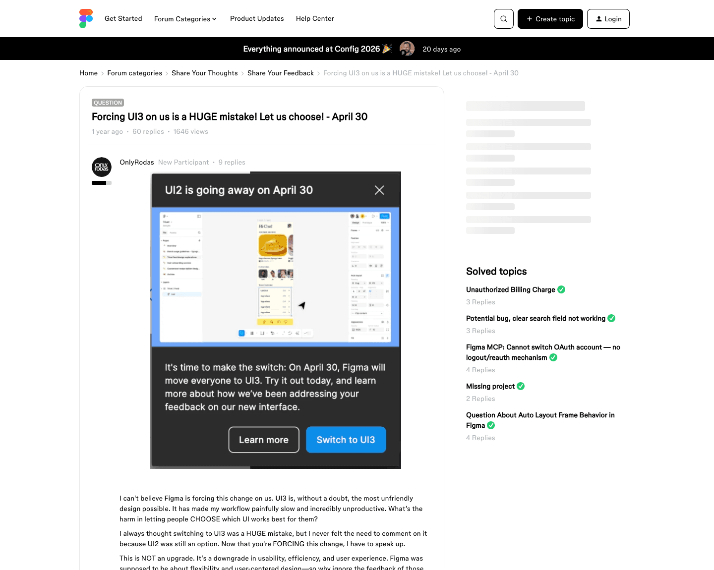
That modal is the whole mechanic in one screen. A real date, one sentence on why, a way to learn more, and a one-click way to switch right then. Nobody has to go dig up a release-notes page to find out what is changing or when.
3. Expect the loudest users to show up in public, and read what they actually say.
The thread wrapping that screenshot is the honest half of the lesson. Sixty replies, most of them from long-time users saying the new interface slowed down their exact workflow. Figma eventually closed the topic for replies, which tells you the volume was real, not that the complaints stopped. They just moved somewhere Figma was no longer watching in that thread.
The read
- The opt-in window is the re-onboarding, not a grace period. Ten months of optional access is ten months of people learning the new UI while they still have an escape hatch, which is a far gentler teacher than a forced Monday-morning switch.
- The in-app message has to carry the real deadline and a real answer, not vague reassurance. "UI2 is going away on April 30" plus a Switch button beats any changelog email, because it shows up exactly where the decision has to be made.
- Public pushback is not proof the play failed. It is proof people cared enough about your product to fight for their workflow. Mixed adoption and a loud forum thread are the normal price of a major redesign, not a sign you should have skipped the reintroduction.
Steal it
Run it in three parts. Gate your next major redesign behind a real toggle users can flip off, not a forced flag hidden in a feature branch. Fire a short interactive tour the first time someone opts in, one where they click the real button or menu to advance, not a carousel they can X out of in one tap. Log every piece of confusion that shows up during the opt-in window, in support tickets, in-app feedback, or your own forum, and turn the recurring ones into the tutorials you ship before the cutover date arrives.
Defend it by setting the forced-cutover date before you start, and holding it. An opt-in window with no announced end becomes the permanent state, and you never get the tutorials finished because there is no deadline forcing the work. And do not read a quiet complaints channel as a healthy one. If your version of that forum thread goes silent, check whether people stopped complaining or just stopped complaining to you.
Gotchas
- A long opt-in window still ends in a hard day. Figma's ran ten months and users still filled a forum thread with complaints on April 30 anyway. Budget for real anger at the deadline even after doing everything else right.
- Closing the complaint thread does not close the complaint. Figma marked its thread closed for replies, which stops the count going up in public but does not mean the sentiment went away. It moved to wherever your users talk when you are not in the room.
- An opt-in tour only works if it is genuinely skippable and genuinely short. Users who feel trapped inside a mandatory walkthrough resent it before it even teaches them anything, which is the fastest way to turn a re-onboarding tool into one more thing they are mad about.