Design The Unfurl
The 1200 by 630 image is the ad you run every time someone pastes your URL.
Most pages still unfurl as a title, a random crop of the hero, or the company logo on a dark square. That card is what Slack, X, LinkedIn, iMessage, and every README show before anyone clicks. If the card is a logo, the click is a guess. If the card is a sentence, the click is a decision.
What to do: Give every important URL its own Open Graph image. The title on the card should be the promise of the page. Generate them in the build or from a small endpoint. Then paste the URL into Slack and look at it the way a stranger would.
Why it works: You do not get a second chance at the unfurl. The image is the pitch for people who will never open the tab.
Example: Antonio Oliveira, senior technical architect at Oak Oliver, published the measurement on February 5, 2026. Mentoring links shared on social used to render as a plain URL with the company logo. Click-through sat around 1.2%. After a unique card on every page, it jumped to 3.8%. He calls that a 3x improvement from a PNG. The cards that moved the number showed a face, a name, a specialty, and a rating.
Walk it through
I opened the post, then I pulled two live image files so the difference is on the page, not in a slogan.
1. Read the before and after in their own words.
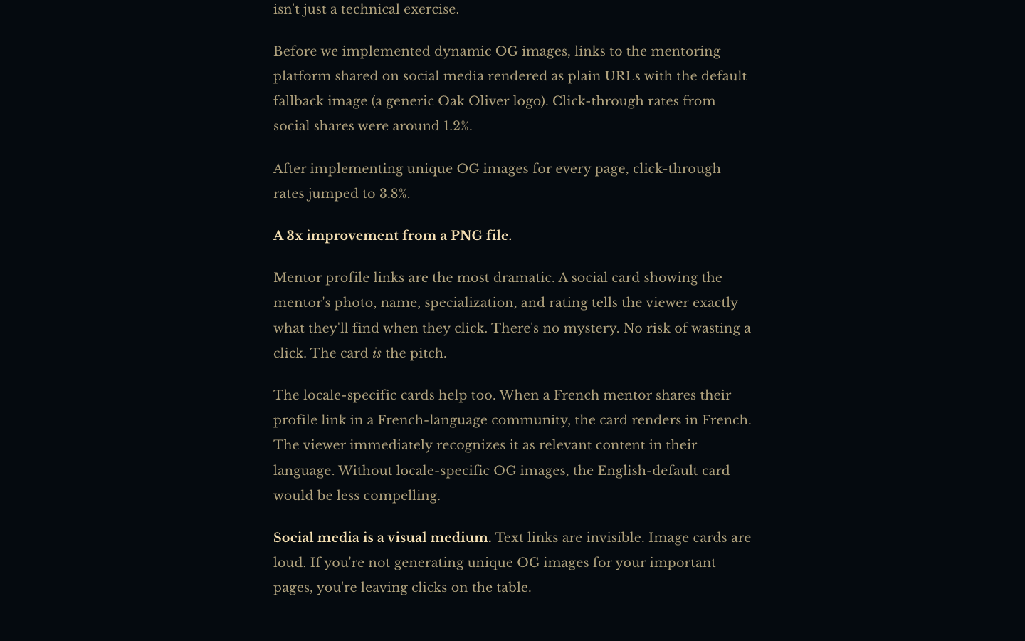
The fallback was a logo. The treatment was a card that removed the mystery. Mentor profiles did the most work, because the viewer could see who they would land on. Locale-specific cards mattered too. A French share that unfurls in English looks like the wrong room.
2. A designed file can still be a logo.
curl -sI "https://linear.app/api/og/main?title=Linear&v=4"
That URL is the og:image on linear.app. It is not a cropped screenshot of the app. It is a card they chose. It is also just the mark. Oak Oliver's "before" is this shape. On-brand and useless in a feed are compatible.
3. The card has to carry the page.
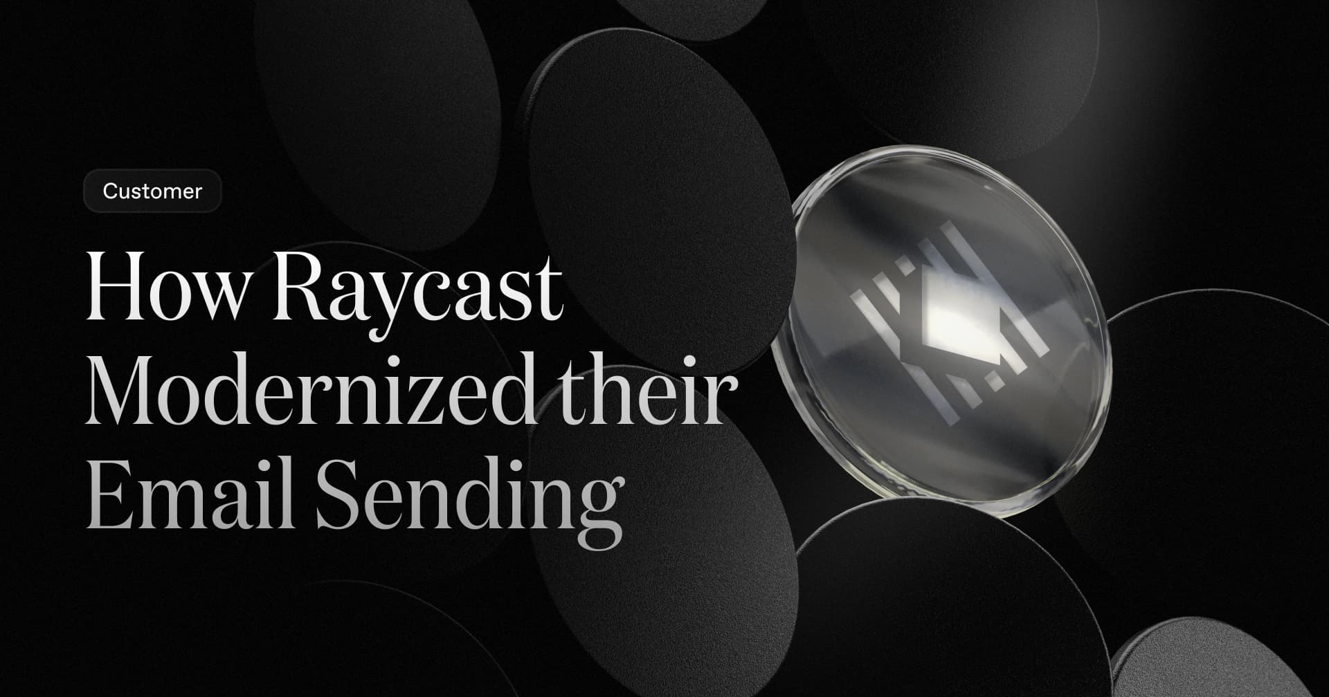
Resend's post at resend.com/blog/how-raycast-modernized-their-email-sending unfurls as the headline, set as type, on a frame you would recognize without reading the domain. That is the standard. If you have many pages, generate one per URL at build time the way Oak Oliver did, or serve a title parameter from a small route. This site does the second one at /og?title=.
The read
- The card is a landing page with one job. Click or ignore.
- A logo is the failure mode. A 1200 by 630 wordmark is still a guess.
- You can generate these. You need a template and a title, not a designer on every post.
Steal it
Have the assistant stand up a route that takes a title and returns a 1200 by 630 card, the way this site does at /og?title=. Then paste your last five public URLs into Slack. If two of them share an image, you still have a default. Throw away any card you would not click. A Figma frame is fine for the first look. It is not the system. The system is one designed card per URL you expect someone else to paste.
Gotchas
- 3.8% is Oak Oliver's number, on their mentoring links. Run your own two-week test before you quote it.
- The blog post is ahead of the profile I checked. In September 2026,
mentoring.oakoliver.com/en-US/mentors/antonioadvertised a large Twitter card and shipped noog:imageat all. Do not cite the lift as if every mentor URL still unfurls the card. - A beautiful card that lies will bounce. If the page is a signup form and the card looks like an essay, you paid for the wrong click.
- Do not render these on a cold function the minute a launch post gets pasted. Cache them. Oak Oliver built 480 of them at compile time for a reason.